 webstacy
SaaS Conversion Audit: Want to benchmark your marketing site, Core Web Vitals, and demo funnel?
High-Converting Landing Page Design: 2026 Playbook
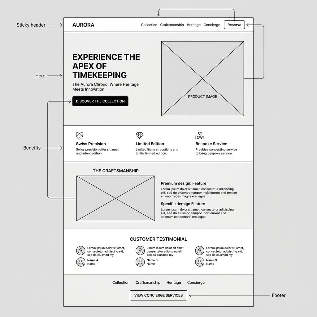
The Anatomy of a High-Converting Landing Page
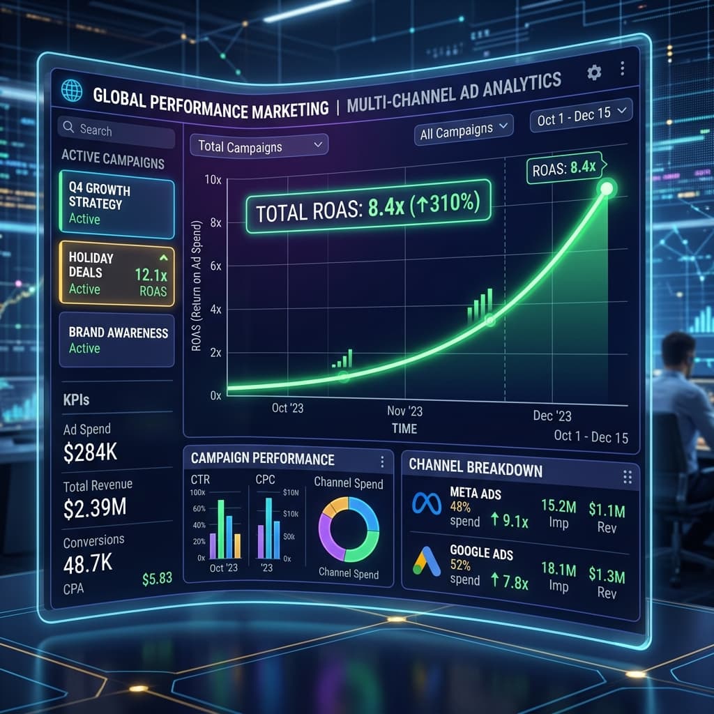
When running paid ad campaigns on Meta, Google Ads, or LinkedIn, your conversion rate directly dictates your Customer Acquisition Cost (CAC) and Return on Ad Spend (ROAS). Sending paid traffic to a corporate homepage with multiple navigation links leads to decision paralysis and high bounce rates.
1. The Above-the-Fold Hero Section Formula
Within the first 3 seconds, a prospective customer must understand three things:
- What you offer: Clear, bold headline stating the primary transformation.
- Who it is for: Direct sub-headline calling out the target audience and main benefit.
- What action to take: High-contrast Call to Action (CTA) button with zero ambiguity (e.g., "Book Your Free Audit Call").
2. Social Proof & Trust Architecture
Place high-trust logos, verified client reviews, star ratings, and real case study outcome metrics immediately below the hero CTA to dismantle buyer skepticism early.
3. Frictionless Micro-Forms
Reduce input fields to absolute essentials. Replace long, daunting multi-page forms with interactive step-by-step selectors that engage the user visually before asking for contact info.
Optimizing Landing Pages with Webstacy
Every landing page engineered by Webstacy is A/B test ready, fully responsive, and built for sub-second page loads to maximize ad dollar conversion efficiency — see how it fits into our paid ads management service. For a deeper dive into turning that traffic into revenue, see our conversion rate optimization guide.
The Above-the-Fold Checklist
Visitors decide whether to keep scrolling within seconds. Everything essential needs to be visible without scrolling, on both desktop and mobile.
- A headline that states the specific outcome, not a vague brand tagline.
- A subheadline that removes the obvious objection ("no contract," "results in 30 days," etc.).
- One clear, singular call to action — not three competing buttons.
- A trust signal — a real number, logo, or review — visible without scrolling.
- Fast load time; every extra second above the fold costs conversions before the message is even read.
Elements That Move Conversion Rate
| Element | Why It Matters |
|---|---|
| Message match with the ad/search query | Confirms the visitor landed in the right place |
| Single conversion goal per page | Removes decision paralysis |
| Social proof near the CTA | Reduces last-moment hesitation |
| Form length matched to offer value | Long forms kill low-commitment offers |
| Mobile-first layout | Most paid and organic traffic now arrives on mobile |
Why Generic Homepages Underperform as Landing Pages
A homepage has to serve every visitor — new prospects, returning customers, job applicants, press. A landing page has exactly one job: continue the specific promise that got the visitor to click in the first place. Sending paid traffic to a homepage forces visitors to re-orient themselves and hunt for relevance, and every extra click or scroll before the offer is understood costs conversions.
Design that looks good and design that converts aren't always the same thing — the goal isn't visual polish for its own sake, it's removing every point of friction between arrival and action.
Copywriting Structure That Supports Conversion
Strong landing page copy generally follows a predictable arc: state the outcome, address the obvious objection, provide proof, and remove friction from the final action.
| Section | Purpose |
|---|---|
| Headline | State the specific outcome, not a vague brand statement |
| Subheadline | Remove the most likely objection immediately |
| Proof section | Numbers, testimonials, or logos that back the claim |
| Objection handling | Address price, time, or trust concerns directly |
| Final CTA | Low-friction, singular next step |
Testing Landing Pages Without Guessing
Redesigning a landing page based on opinion alone is a common and expensive mistake — what looks better in a design review doesn't always convert better with real traffic. A structured approach tests one variable at a time (headline, hero image, CTA copy) against a clear baseline, and only rolls out a change once it's shown a statistically meaningful lift, not just a visually preferred option in a meeting.
Trust Signals That Actually Move the Needle
| Trust Signal | Why It Works |
|---|---|
| Specific numbers over vague claims | "500+ families helped" outperforms "trusted by many" |
| Real client logos or names | Verifiable, harder to dismiss than generic testimonials |
| Third-party review platforms | Perceived as less biased than on-site-only testimonials |
| Security/payment badges near forms | Reduces hesitation at the exact moment of commitment |
Mobile-First Isn't Optional
For most industries, the majority of landing page traffic now arrives on mobile — meaning the mobile layout should be the primary design target, with desktop treated as the expanded view, not the other way around. Common mobile-specific failures include tap targets sized for a mouse cursor, forms that require excessive zooming, and hero sections so tall the actual offer sits below the first screen — each one directly suppressing conversion rate on the majority of your traffic.
The Role of Page Load Speed in Conversion
Every additional second of load time compounds against conversion rate — visitors abandon before the offer is even visible, and the ones who wait arrive already primed to bounce. This is why landing pages built for paid traffic are engineered separately from a general marketing site: minimal third-party scripts, optimized images, and a lean codebase built specifically to load fast under real-world mobile network conditions.
Matching Design Complexity to the Offer
A low-commitment offer (a free guide, a newsletter signup) converts best with a short, simple page and minimal friction. A high-commitment offer (a demo request, a large purchase) generally needs more proof, more detail, and more objection-handling before a visitor is ready to act. Applying the same short-form template to every offer regardless of commitment level is a common reason otherwise well-designed pages underperform — the page's depth should match what's actually being asked of the visitor.
Post-Launch: Treating a Landing Page as a Living Asset
A landing page's first version is a starting hypothesis, not a finished product — ongoing review of on-page behavior (scroll depth, form abandonment points, click patterns) reveals exactly where the page can improve further, and the highest-performing pages are almost always the result of several iterations informed by real visitor data rather than a single, one-time design pass.
A high-converting page still needs qualified traffic — see Scaling Google & Meta Ads ROAS: 2026 Strategy for how to send the right visitors to it.
Frequently Asked Questions
The 2026 median sits around 6.6%, but top-performing pages convert above 11% — the right benchmark depends on your offer, traffic source, and industry.
Always a dedicated landing page — homepages have too many navigation options and generic messaging, which increases decision paralysis and drops conversion rates versus a focused, single-offer page.
As few as possible — every additional field reduces completion rates. Ask only for what you need to qualify and follow up (typically name, email, and one qualifying question).
Continuously for active campaigns — test one variable at a time (headline, CTA, hero image) and let each test run until you hit statistical significance, typically 1–2 weeks depending on traffic volume.
Paid Ads Management
Maximize return on ad spend (ROAS) with hyper-targeted campaigns across Meta, Google, and TikTok.
Ready to Scale Your SaaS Pipeline?
Schedule a strategy call with Webstacy. We will analyze your website, Core Web Vitals, and demo booking funnel to unlock compounding pipeline growth.